Works
RYAN LAU
MY TIME CONCERT PRODUCTION
RYAN LAU
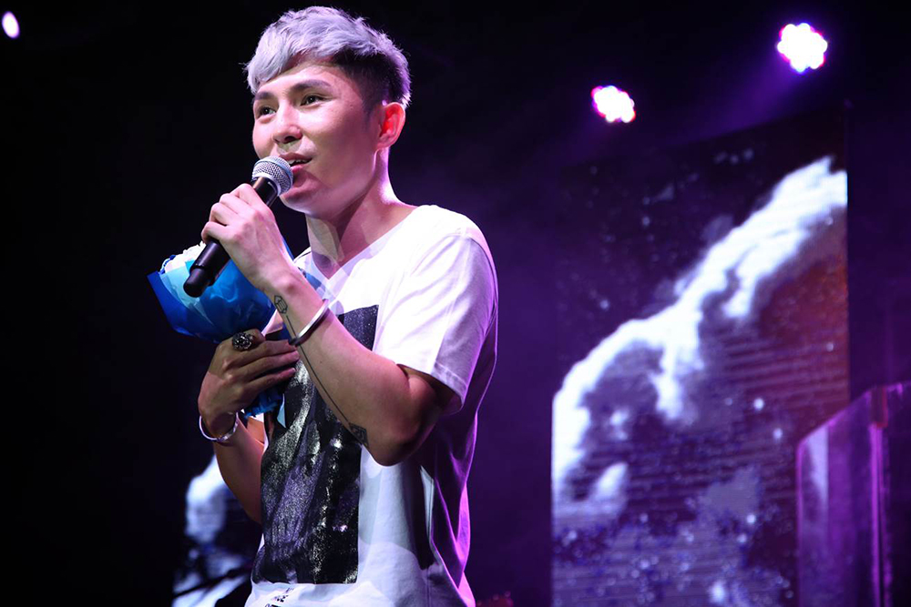
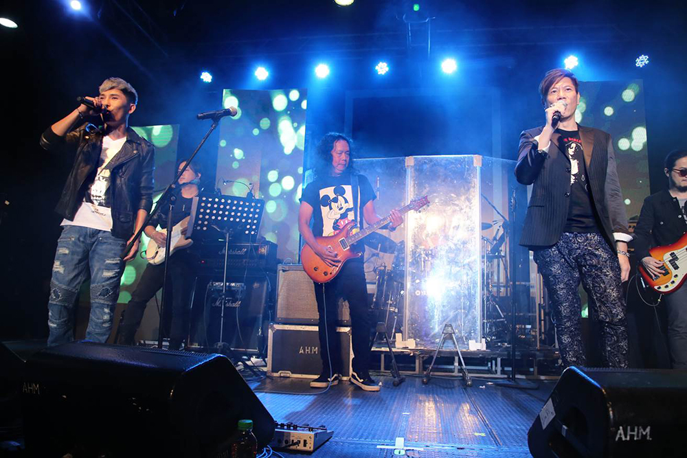
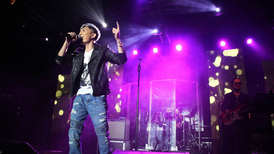
Ryan Lau held his very first solo concert ‘My Time’ in Music Zone of KITEC, reaching another milestone on his career path. His performance with his fellow guests allowed the fans to feel music from a brand new perspective. Chessman Hong Kong organized and planned the entire show that all promotional materials and designs were based on the main theme ‘my time’
劉威煌首個個人音樂會於假九龍灣展貿中心Music Zone舉行首個個人音樂會《My Time》,為其音樂路樹立另一里程碑,當天與一眾嘉賓引領樂迷從嶄新角度品味音樂。棋人香港為整個音樂會的主辦方兼統籌,宣傳及設計均配合「My Time」的主題。